Designing clarity for complex products.

I’m Peter Mendes, a principal-level UX and product designer who turns complex enterprise workflows into clear, accessible, build-ready experiences.

Peter Mendes, principal UX and product designer
About

Visual craft, systems thinking, and practical delivery.

For more than 26 years, I’ve worked across visual design, UX, product design, and front-end implementation. I partner with product and engineering to clarify requirements, simplify workflows, establish reusable patterns, and protect design quality through implementation and release.

Selected enterprise work

Designing clarity where complexity matters.

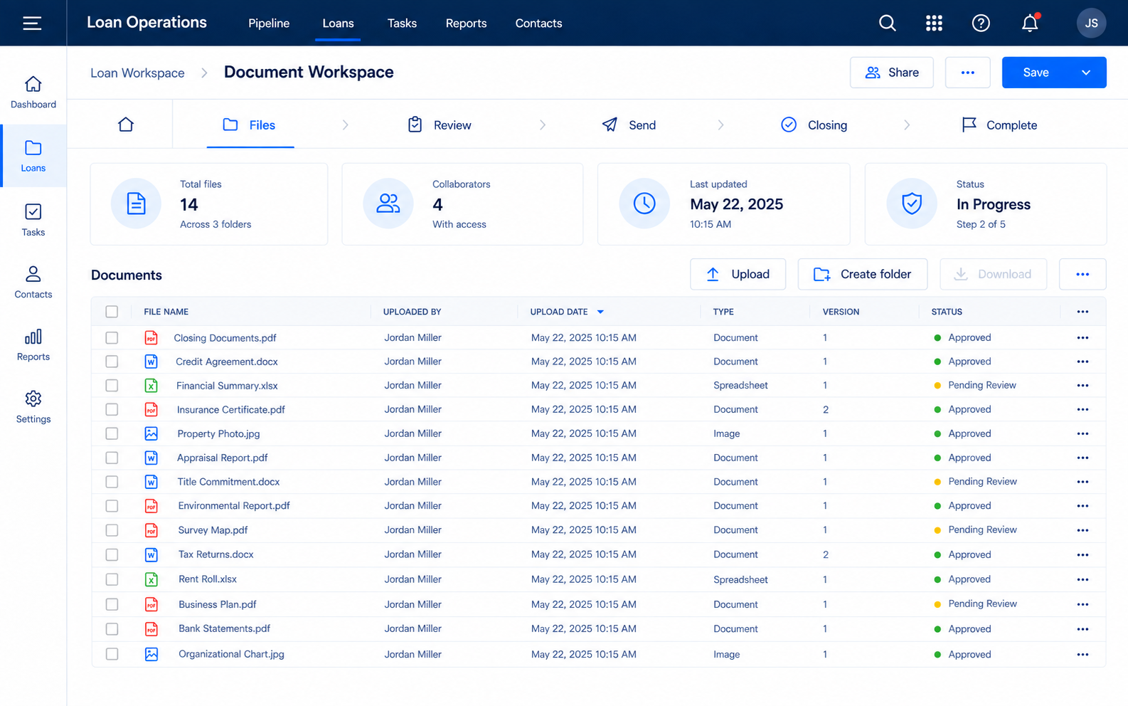
Original concept visual of a Loan Operations document workspace with a navy application shell, workflow stages, summary cards, and a document table.
Original shared-system reconstruction using fictional documents and workflow data.
Document-management workflow

Encompass web eFolder redesign

Redesigned a dense document workflow into clearer, accessible task-based interactions.

View Case Study
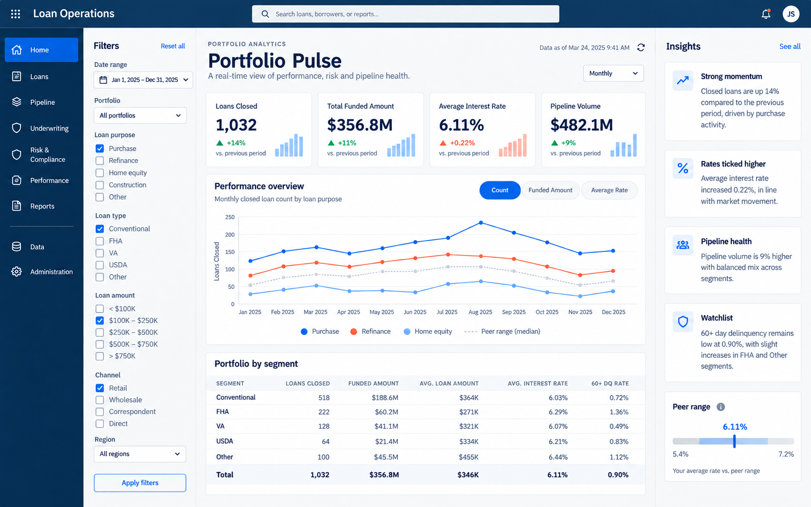
Original concept visual of a Loan Operations analytics dashboard with filters, benchmark comparisons, a chart, and portfolio-health insights.
Original shared-system reconstruction using fictional data.
Data intelligence platform

Insights platform

Turned complex mortgage-performance data into dashboards teams could scan, compare, and act on.

View Case Study
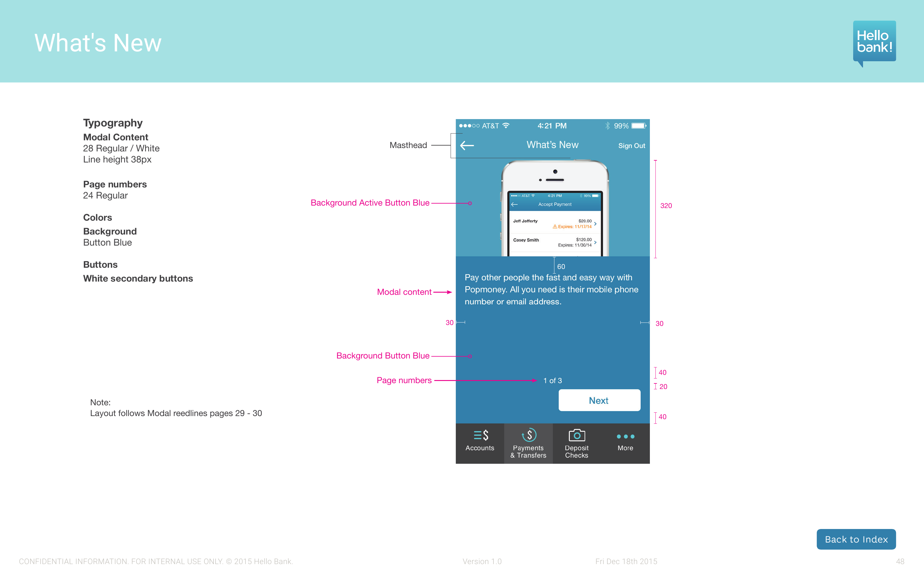
Hello Bank What's New style-guide page with the annotated mobile screen and component specifications
Mobile banking experience

Hello bank! mobile banking experience

Led a build-ready mobile-banking experience spanning core flows, patterns, and implementation specifications.

View Case Study
Systems & methods

Systems that scale across products.

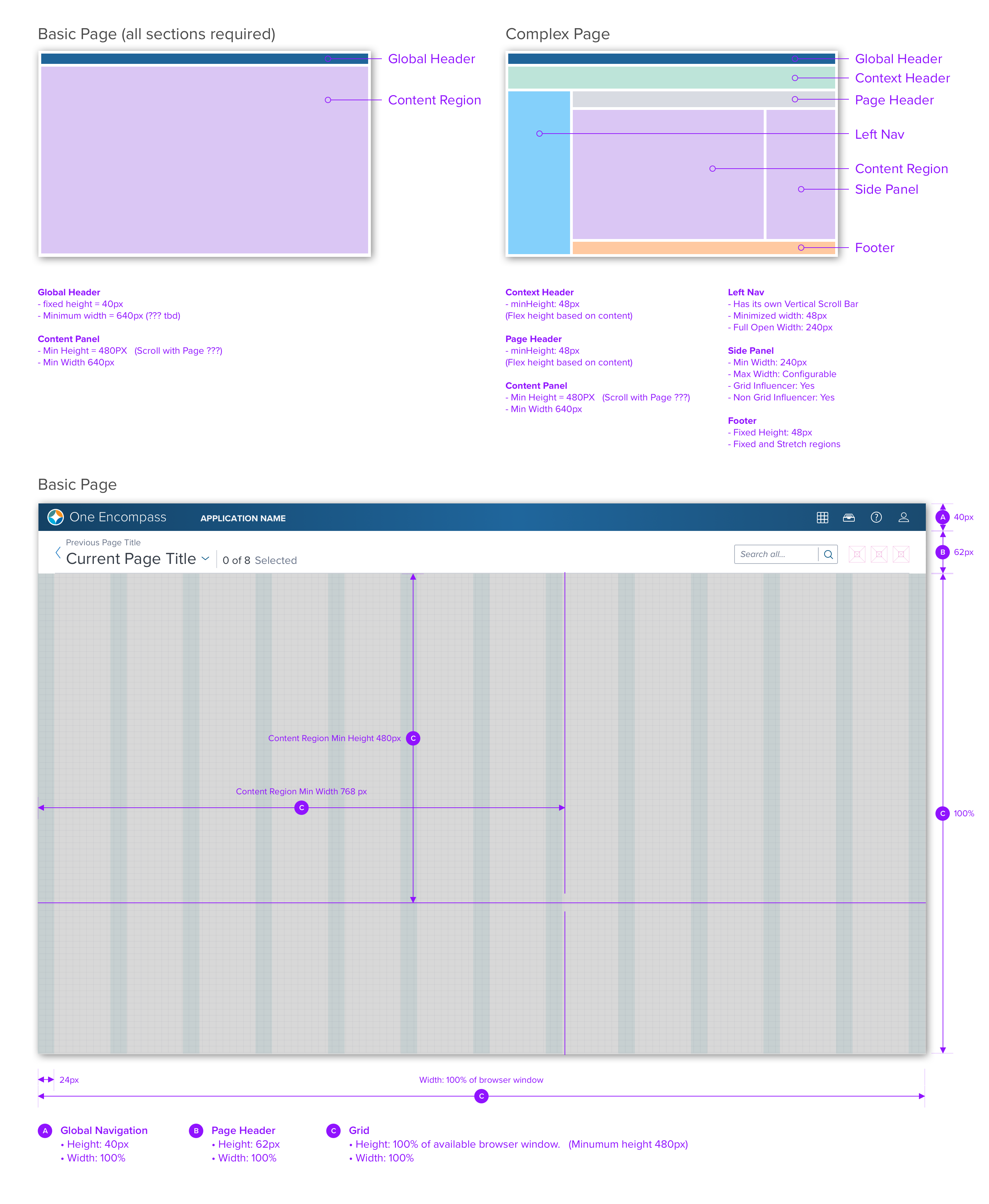
Annotated desktop page-structure layout pattern showing global headers, navigation, content regions, and a side panel.
Layout pattern: a documented desktop framework for simple and complex application pages.
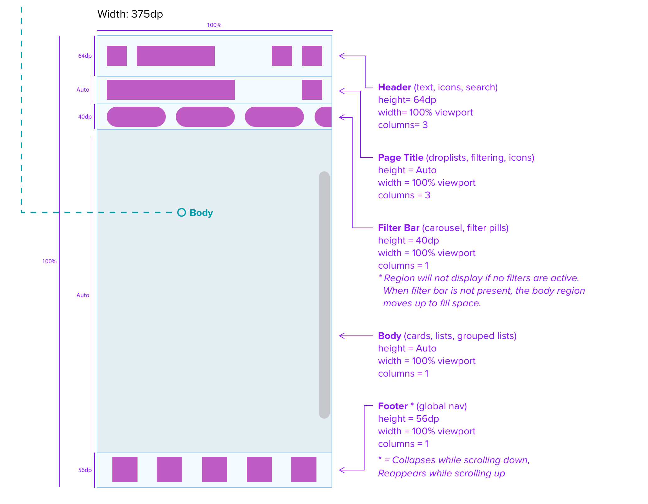
Annotated mobile page-structure layout pattern showing header, title, filter bar, content body, and bottom navigation.
Layout pattern: a mobile framework that preserves hierarchy across smaller screens.

As an early contributor, I helped shape governance and documentation for accessible component patterns used across real product workflows.

Product strategyComplex workflowsDesign systemsAccessibilityDesign–engineering collaboration
Explore the Dim Sum Design System
Visual practice · Brand & identity

Building identities with clarity and character.

Visual work organized by discipline, with focused previews and deeper galleries when you want to see the full range.


Brand & Visual Design

View Brand & Visual Design
Flags of Hope flyer design
Milk Bar flyer design

Web & Campaign Design

Let’s connect

Building a product team that values thoughtful, high-impact design?

I’d welcome the conversation. Tell me about the team, product, or design challenge you’re building.