Clarity at a glance
Account balances and key actions are surfaced with a hierarchy designed for quick, confident scanning.

As Mobile App UX Lead Visual Designer, I helped shape a build-ready U.S. mobile-banking experience and a supporting design system spanning everyday banking flows, interaction patterns, and implementation-ready specifications.
Mobile banking depends on confidence. People need to understand account information quickly, complete high-frequency tasks reliably, and trust the experience when handling sensitive financial information.
The work brought sign-in, account overview, payments, payees, check deposit, and related workflows into a more coherent visual and interaction system.
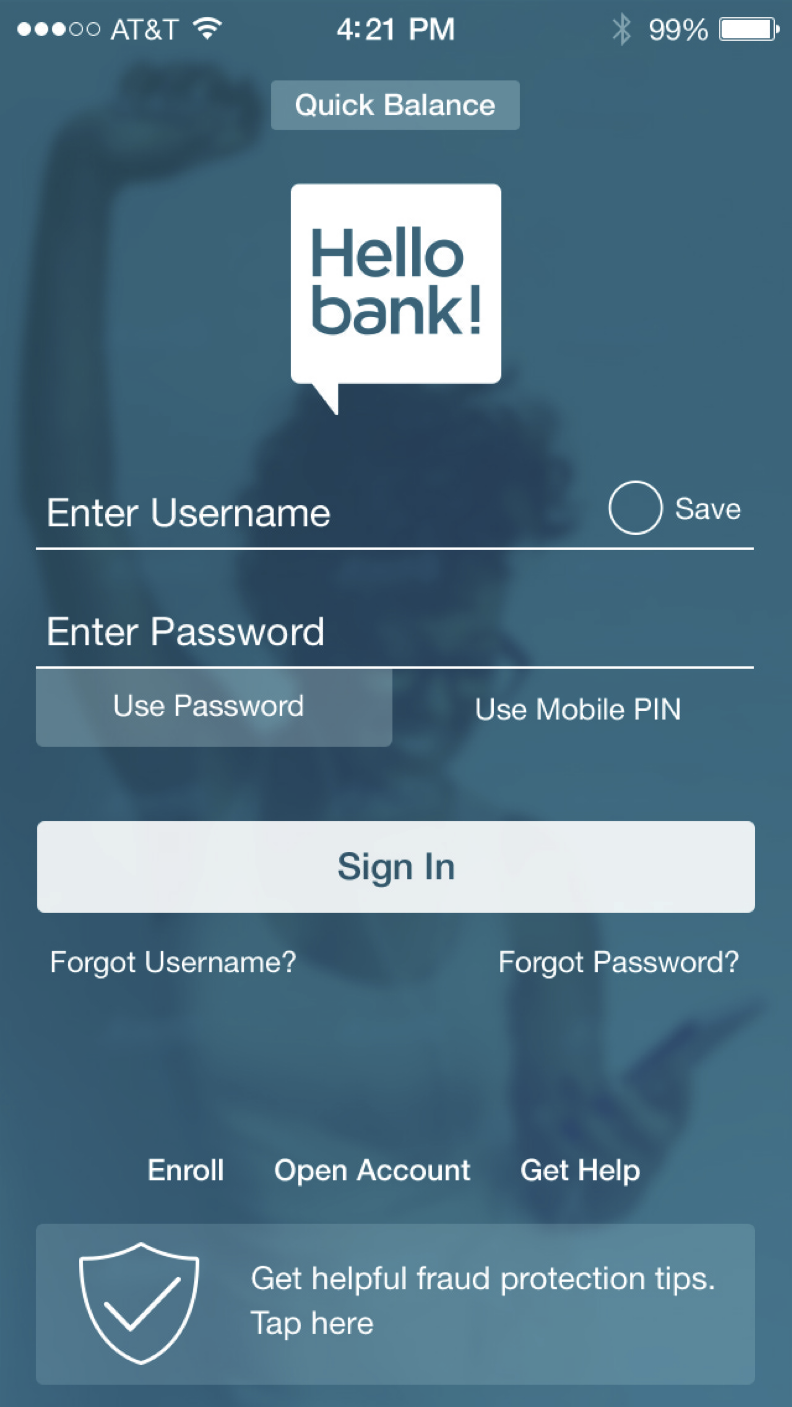
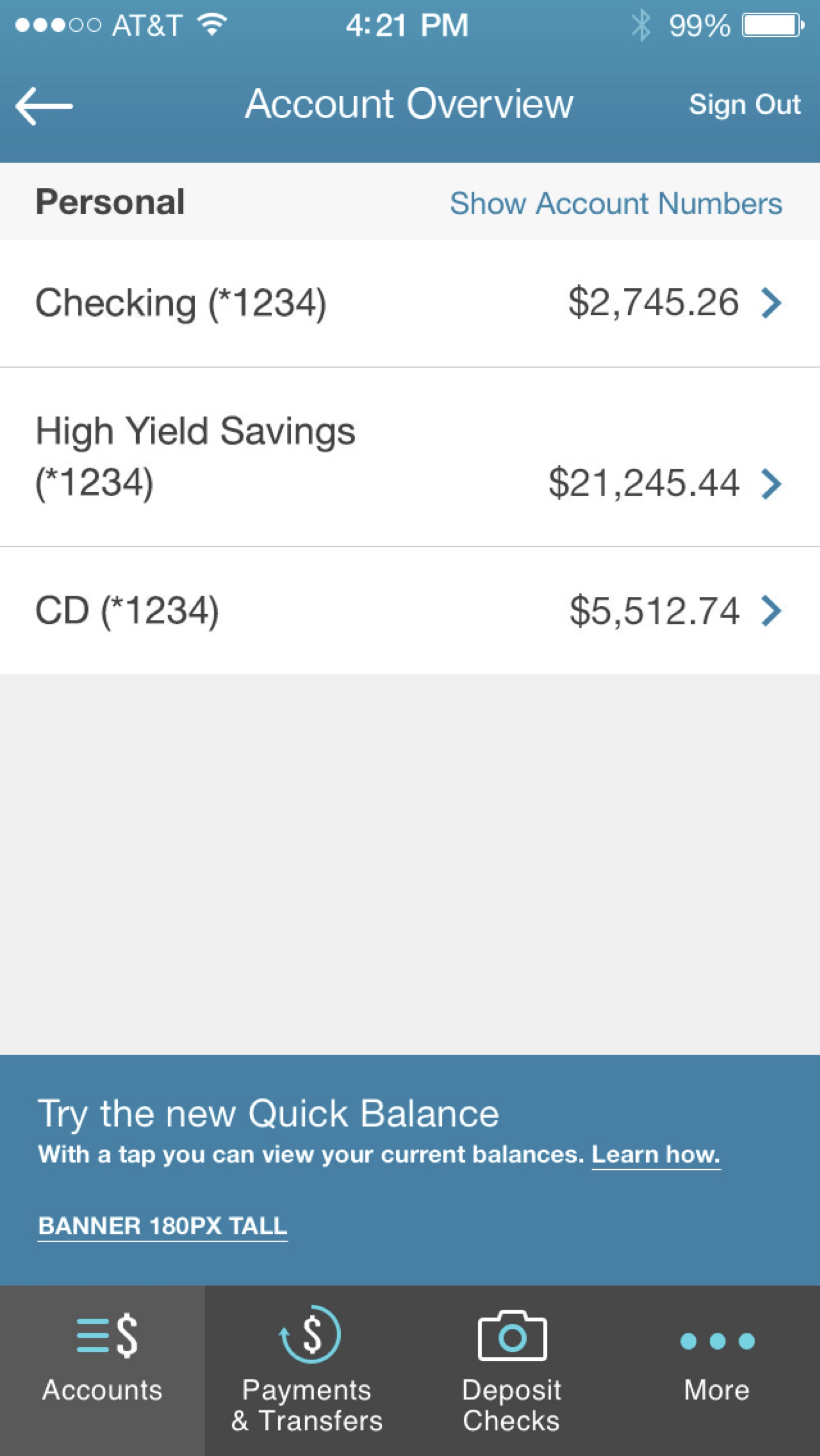
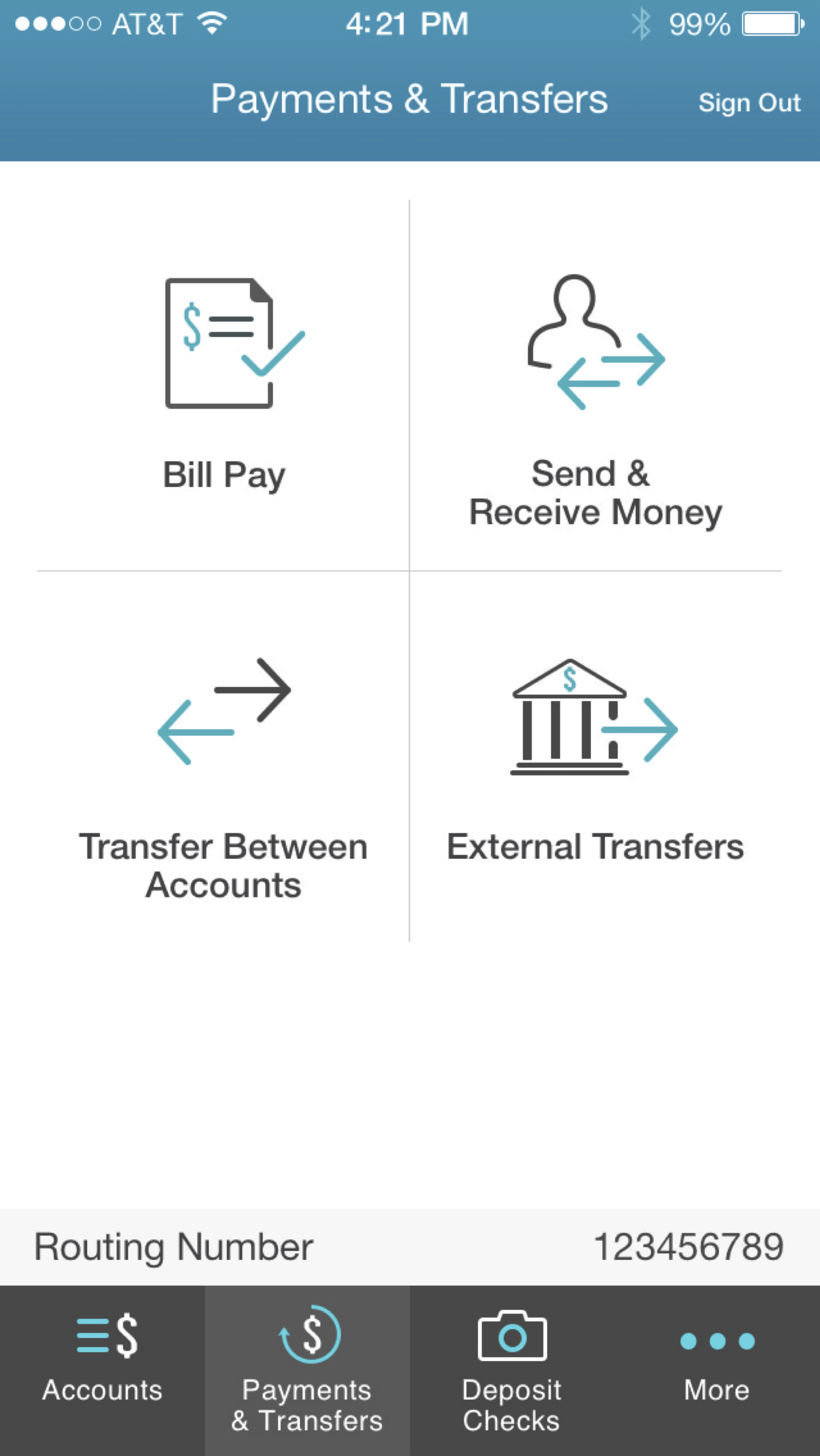
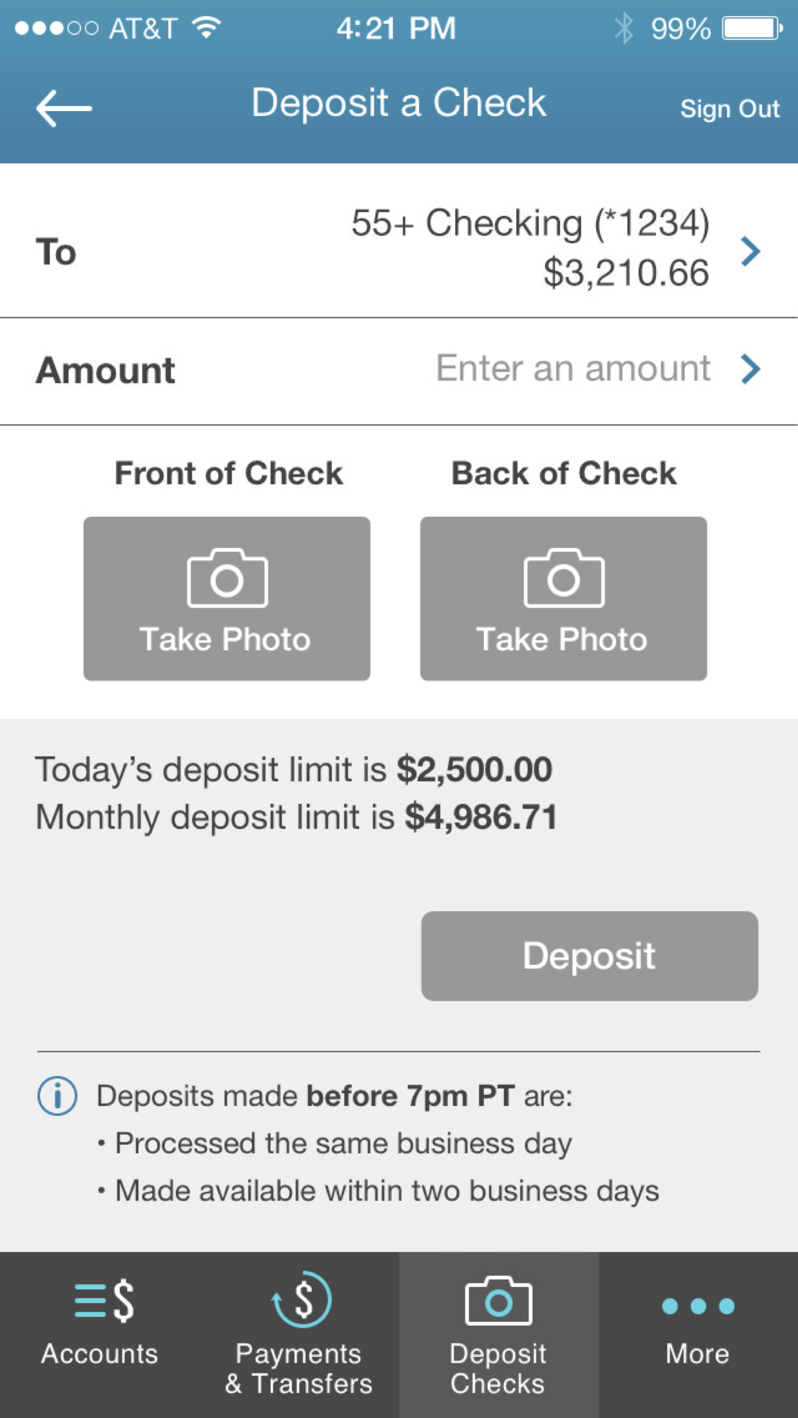
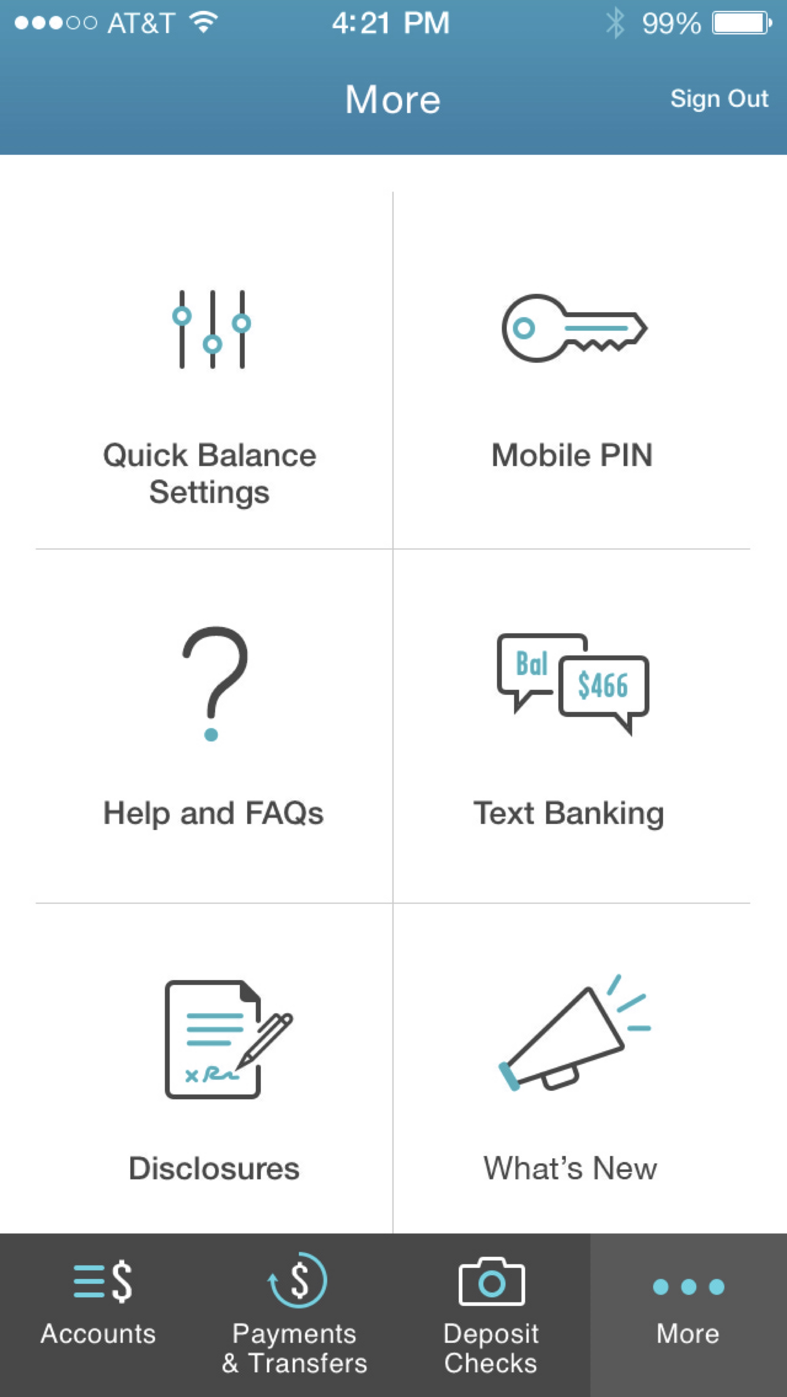
I served as the mobile app UX lead visual designer, partnering with the broader team to create a cohesive experience across core banking flows.
My work focused on visual hierarchy, navigation, interaction states, reusable patterns, screen templates, and documentation that made the intended experience clear for product and engineering.
Account balances and key actions are surfaced with a hierarchy designed for quick, confident scanning.
Core tasks such as paying bills and depositing checks use focused flows with visible next steps.
Security guidance, help, and service paths are integrated into the experience instead of treated as an afterthought.
The mobile experience depended on a reusable system rather than one-off screens. I helped shape foundational guidance for type, color, navigation, content structure, form patterns, buttons, modals, account views, PIN interactions, and check-capture states.
That shared foundation reduced repeated design decisions and gave teams a more consistent way to extend the experience.
Established type, color, navigation, content structure, screen templates, and implementation-ready specifications that gave every flow a shared foundation.
View mobile style guideDefined forms, buttons, modals, PIN patterns, account views, and check-capture states to reduce one-off design decisions.
Try working prototypeCreated a disciplined icon language with clear roles, consistent anatomy, readable stroke weights, and intentional labels.
View icon strategyThe work included detailed specifications, reusable interaction patterns, and high-fidelity screen designs that gave engineering a practical reference for implementation.
I brought a production mindset to the work: making decisions explicit, supporting design reviews, and helping protect visual and interaction quality as the experience moved toward development.
Hello bank! remains a meaningful example of product and system design: a cohesive mobile-banking experience, documented interaction patterns, and high-fidelity delivery prepared for engineering.
The product did not launch after BNP Paribas changed its U.S. market strategy.